Recently, I was asked by a reviewer to include a large number of regression results in a manuscript I am revising. In my experience, attempting to display more than a few regression results in tabular format is a fool’s errand so I went looking for a more visual means of delivering the content. My attempt at doing this is complicated by the estimation taking place in one piece of software (Stata) and visualization taking place in another ( R ).
This disconnect between estimation and visualization adds an extra step (and could be solved by doing the estimation in R, something I have decided not to do for the time being) and prevents me from using one of the many R packages for coefficient plotting. Therefore, I estimate 4 regressions in Stata (using my preferred reghdfe command) and extract the coefficients, standard errors, and standard deviation (for standardization) of each variable along with the model label. I then move over to R. Borrowing heavily from Thomas Leeper and Andrew Heiss, I import the data, standardize the coefficients and standard errors, and build the plot (see below).
library(tidyverse)
library(readxl)

plot.data <- read_excel("popgrow-coeff.xlsx", sheet = "popgrow", col_types = c("guess", "numeric", "numeric", "numeric", "guess"))

multiplier <- qnorm(1 - 0.05 / 2)

plot.data <- plot.data %>%
  mutate(std.est = estimate * sd,
  std.se = se * sd,
  ymin = std.est - (multiplier * std.se),
  ymax = std.est + (multiplier * std.se),
  term = factor(term, levels = rev(c("Central city population share",
  "Suburban municipal fragmentation",
  "Suburban unincorporated population",
  "School district decentralization",
  "Special district overlap",
  "ln population",
  "Real per capita money income",
  "Growth in log population, 1950-1960",
  "Unemployment rate",
  "Manufacturing share",
  "% population with 16+ year education")), ordered = TRUE),
  group = factor(group, levels = c("1960 to 1970",
    "1960 to 1980",
    "1960 to 1990",
    "1960 to 2000"), ordered = TRUE))

p <- ggplot(plot.data, aes(x = term, y = std.est)) +
  geom_hline(yintercept = 0, colour = "#000000", size = 0.75) +  # Line at 0
  geom_pointrange(aes(ymin = ymin, ymax = ymax, group = rev(group), color = group), position = position_dodge(width = 0.75), size = 1, fatten = 1.25,
    show.legend = T) +  # Ranges for each coefficient
  labs(x="Coefficient", y="Standardized Estimate", title="Population Growth") +  # Labels
  coord_flip() +  # Rotate the plot
  theme_bw() +
  theme(legend.position="bottom",
    legend.title = element_blank())
The primary issue is the 4 models are highly related so using something like facet_wrap is a bit inappropriate. I want the coefficients stacked. This is easily achieved using the group option in geom_pointrange. A little adjustment is necessary to get the points and ranges to be more visible in what will eventually be a printed figure. The output can be seen below.
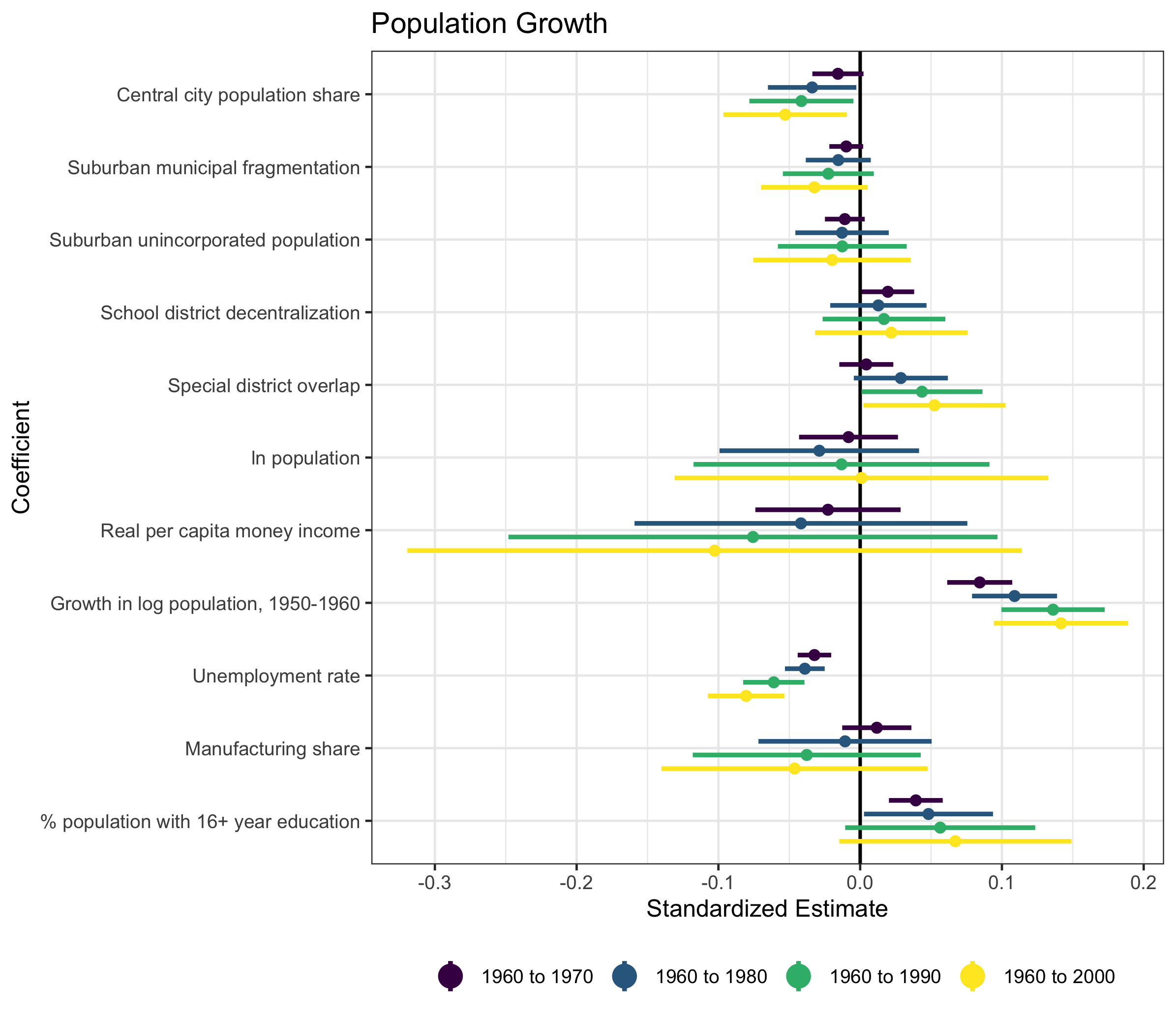
I think this is a very clean way to display a lot of dense information. An added benefit is facet_wrap can be used for subgroup analysis.