The Urban Institute has released a new package for mapping state and county data in R, urbnmapr. Their posts can be found here and here. Since I occasionally write about how to make simple maps in R, I am going to quickly go from start to finish on making a county map.
Installation
Installation is easy. The library is hosted on Urban’s GitHub page. Installing R packages from non-CRAN sources requires the devtools package.
require("devtools")
devtools::install_github(“UrbanInstitute/urbnmapr”)
Example
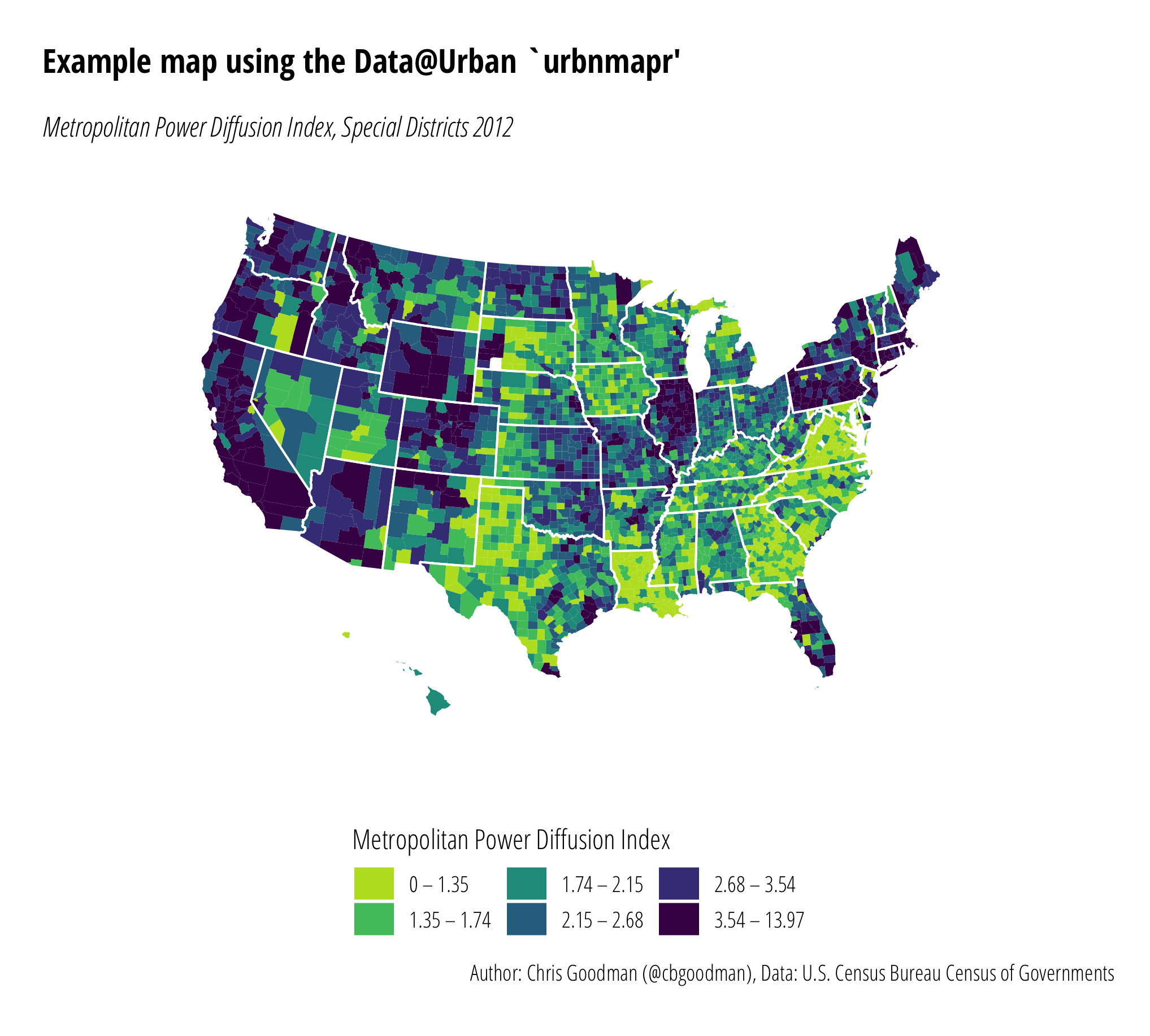
Let’s dive into any example. Since my last Maps in R post used data on the Metropolitan Power Diffusion Index for special districts from year 2012, we’ll use the same data. The base data comes from the 2012 Census of Governments
urbnmapr is a package to map states and/or counties in ggplot2 so for simplicity sake, we’ll load the entire tidyverse library. We’ll need to load dplyr for the join anyways. I have loaded the viridis library to gain access to the Viridis color scale. This isn’t necessary, but I like the color options.
To add the MPDI data to the urbnmapr data, left_join() from the dplyr package is used. One thing to pay close attention to is this requires the joining data to be of the same class. county_fips in urbnmapr::counties is of class character; hence, my import of the county FIPS variable as “character”.
library("tidyverse")
library("viridis")
library("urbnmapr")

# Add data
mpdi <- read.csv("mpdi.csv", header=TRUE, sep=",",
        quote="\"", colClass=c("character", "numeric"))
# Join with urbnmapr
mpdi.data <- left_join(mpdi, counties, by = "county_fips")
With the data imported and joined, I next define some cut points in the data. This step isn’t strictly necessary depending on your data (ggplot2 will attempt to map any numerical data on a continuous scale). For these data, defining some cut points makes for a more meaningful map.
# Create quantiles
no_classes <- 6
labels <- c()
quantiles <- quantile(mpdi.data$mpdi,
                      probs = seq(0, 1, length.out = no_classes + 1))
# Custom labels, rounding
labels <- c()
for(idx in 1:length(quantiles)){
  labels <- c(labels, paste0(round(quantiles[idx], 2),
  " – ",
  round(quantiles[idx + 1], 2)))
}
# Minus one label to remove the odd ending one
labels <- labels[1:length(labels)-1]

# Create new variable for fill
mpdi.data$mpdi.quantiles <- cut(mpdi.data$mpdi,
  breaks = quantiles,
  labels = labels,
  include.lowest = T)
From here, we plot! If you’re at all familiar with ggplot2, this should look very familiar. The two geom_polygon lines define the filled county map and the state outline map. coord_map() defines the map projection. Urban’s post uses the Albers projection, but I happen to like the polyconic projection and that’s what is used here. coord_map() can use any projection in the mapproj package so the choice of projection is up to you. scale_fill_viridis() uses the virdis library to assign colors. I have reversed the usual color scale and trimmed off the top color (end=0.9, bright yellow). The remainder of the code is theming. I remove all the axis labels and coloring, change the default font, and move the legend around.
ggplot() +
  # County map
  geom_polygon(data = mpdi.data,
    mapping = aes(x = long, y = lat,
      group = group,
      fill = mpdi.data$mpdi.quantiles)) +
  # Add state outlines
  geom_polygon(data = urbnmapr::states,
    mapping = aes(long, lat,group = group),
    fill = NA, color = "#ffffff", size = 0.4) +
  # Projection
  coord_map(projection = "polyconic")+
  # Fill color
  scale_fill_viridis(
    option = "viridis",
    name = "Metropolitan Power Diffusion Index",
    discrete = T,
    direction = -1,
    end=0.9,
    guide = guide_legend(
      keyheight = unit(5, units = "mm"),
      title.position = 'top',
      reverse = F)
    )+
  # Theming
  theme_minimal(base_family = "Open Sans Condensed Light")+
  theme(
    legend.position = "bottom",
    legend.text.align = 0,
    plot.margin = unit(c(.5,.5,.2,.5), "cm")) +
  theme(
    axis.line = element_blank(),
    axis.text.x = element_blank(),
    axis.text.y = element_blank(),
    axis.ticks = element_blank(),
    axis.title.x = element_blank(),
    axis.title.y = element_blank(),
    panel.grid.major = element_blank(),
    panel.grid.minor = element_blank(),
    )+
  theme(plot.title=element_text(family="Open Sans Condensed Bold", margin=margin(b=15)))+
  theme(plot.subtitle=element_text(family="Open Sans Condensed Light Italic"))+
  theme(plot.margin=unit(rep(0.5, 4), "cm"))+
  labs(x = "",
       y = "",
       title = "Example map using the Data@Urban `urbnmapr'",
       subtitle = "Metropolitan Power Diffusion Index, Special Districts 2012",
       caption = "Author: Chris Goodman (@cbgoodman), Data: U.S. Census Bureau Census of Governments")
Final Product
The final product is sharp looking. Certainly web-ready and with a little more work is likely print-ready. As I move all my graphics production to ggplot2, urbnmapr is my new go-to for simple state or county mapping. It won’t replace more complex operations requiring shapefiles, but it will reduce the amount of time and effort it takes to make simple maps.